


DE - May 31, 2016
More great work for Fiskars!
We are proud to have been
involved with the new
Gerber - Bear Grylls promotion!


DE - Jan 9, 2015
New Client Gains 2015
Design Etcetera are pleased to be working with Fiskars Corporation, established in Finland in the 17th Century and today makes it one of the oldest businesses in the western world. Today Fiskars operations are consumer-centered and grow through strong specialist brands. Fiskars' consumer products for the home, garden, and outdoors are renowned for their functionality and cutting-edge design.
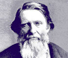
John Ruskin
Quotable Quote
“It's unwise to pay too much, but it's worse to pay too little.
When you pay too much, you lose a little money - that's all.
When you pay too little, you sometimes lose everything,
because the thing you bought was incapable of doing the thing
it was bought to do. The common law of business balance prohibits paying a little and getting a lot - it can't be done.
If you deal with the lowest bidder, it is well to add something for
the risk you run, and if you do that you will have enough to pay
for something better.”
Creative Bloq, July 3, 2014
Adobe Muse CC 2014 review
The web design tool has received an update, but are the new features effective? Lance Evans takes Muse CC 2014 for a test drive.
Adobe's push to Creative Cloud has brought a number of changes to the industry, as well as a number of new applications that are only available as a Creative Cloud member. Adobe's Muse, a web design and development application, was the first of these programs released to entice the user base over.
We've written a lot about Muse so far, and undoubtedly will have a lot more to say as it evolves. Its core selling point, that it lets designers create websites without a stitch of code, has brought with it both cheers and jeers from various groups. But whether you like the concept or not, Adobe has shown great commitment in its steady development thus far, and this new Creative Cloud 2014 release is a really important step, even if much of what you get is under-the-hood and not very flashy.
As Adobe's first Creative Cloud only application, perhaps its development was a bit rushed at the start. It was originally developed using Flash/Flex and Air technologies. While good, the result was not as robust a tool as we are used to from a major developer. Using it was rather sluggish, even on the best computers. It was reminiscent of working with an online application.
So the big news in the world of Muse, with this release, is that Adobe has ported the entire Muse development over to more traditional programming environments, and the new release is now a robust 64-bit application, like the rest of their line. This is an important step, and one that can be felt within five minutes of using the program. Windows now open quickly, and moving items around is fast and responsive.
New Interface
In doing the new re-write, Adobe brought Muse in line with their other current offerings. It now has the dark interface that Adobe adopted a few years ago. But if you are an old-schooler that prefers the lighter interface and background, the Preferences give you four levels of interface style options to choose from.
I'm also happy to report that another pet peeve of my own has been fixed. In previous versions of Muse, the pallets were docked in a way that made me feel like I was always chasing after the tab I wanted, like some whack-a-mole game. Worse yet, there was no way to either tear the pallets off or expand the larger ones like Layers or Assets to full height. Basically, it was a mess. This version implements Adobe's standard pallet interface, a huge improvement.
If you've been a Muse user already, you will also see a wide range of smaller and well thought out interface improvements and additions. The PLAN-DESIGN-PREVIEW-PUBLISH-MANAGE selections that used to occupy a second tier menu line along with the toolbar options, have been moved off to a smaller section in the upper right, and made to look a bit like interface tabs. The toolbar items are now in a standard floating toolbar that hovers along the left. This removes the second tier and gives us almost an extra 50 pixels of vertical working space, for free. Laptoppers rejoice!
The new interface also gives us some more powerful workflow capabilities. For example, we can now have more than one working window display at a time, using the new 'Tile' option. This will allow you to view and compare various versions of the website, say the Desktop version and the Tablet. It will also allow you to more easily swap elements between one interface and another.
This will actually help solve one much requested item in Muse. When we finish designing the Desktop version of a site, and then request Muse to create a tablet or phone version, many of us were surprised to see Muse offers no automatic way to populate that new interface with the content from the previously finished version. Granted, such automatic copying of content will yield a mess, but it still would save a couple of steps of copying items over.
Now having the ability to display two windows we can more easily copy and past. We can even duplicate/resize, and then copy/paste. So while not revolutionary, this is a nice new enhancement to the Muse workflow.
Features Wanting
Beyond interface items, the real feature list in this version is quite short. This must be why despite it being a complete software re-write, Adobe opted to only give it a small incremental version number. This is version 7.4 over last release's 7.3.
This version of Muse has also updated the link found in the 'Library' pallet which in previous version linked us to Adobe's 'Muse Exchange', instead now links us to "'Adobe Add-ons' for Muse. While Exchange was a bit of education and some down-loadable items, the 'Add-ons' section is quite obviously an online store/repository/resource for Muse enhancements (other Adobe programs have their Add-on sections as well).
Integration of such a store is probably a good thing for a program like Muse, which is unable to create interface elements from scratch the way one could in Dreamweaver. And being a designer's program, its user-base will undoubtedly always be on the hunt for the next cool widget. Like fashion knock-offs, we are likely to see a never ending stream of new widgets that replicate the style and functionality of whatever is the web's latest and greatest thing.
One important thing to note, and lay praise to Adobe for: Add-ons is not just a store but also an exchange. About 1/3 of the items on it are 100 per cent free. Let's hope this trend continues since in the long run, the more robust the platform, the more successful Muse will be.
Another nice new item is the '100% Width Slide Show button'. This unassuming button, when clicked, makes your slide show images occupy the entire width of the screen. If I'm not mistaken, this accomplishes the very same thing that in previous versions required you to delicately drag/snap the left and right edges of the slide show to precisely align with the left and right edges of the website. If that is the case, then this is a much improved and far less delicate workflow.
Speaking of previous versions, in moving a current file from version 7.3 to this 7.4 incarnation, I have come across a minor bug or two that users may need to look out for. One is that some of my previously centered slide shows, while still looking fine in the Design interface, were off-center when viewed in Preview or rendered out to HTML. After some back and forth I finally discovered that all I had to do was re-snap the slide show edges to the website edges. I may go back and see if simply clicking the 100% Width button fixes things as well.
Finally, Muse has a feature I have yet to use, but really can't wait to have the opportunity. It lets you the developer grant editorial access to your client or end user. This means you can design and deploy a site and give your client limited access to make changes to it. This is great for clients that need day-to-day alterations and want to do it in-house. While this is not a new feature, previous versions had it limited to sites that were hosted on Adobe's own Business Catalyst server service. That limitation is thankfully lifted and it can be used regardless of where the site is hosted.
Words: Lance Evans
Lance Evans is creative director of Graphlink Media.
Our Verdict 8/10
I have been so happy to see all of the fast and furious development of Muse. I think it's a great program that undoubtedly is finding a tremendous user base. And for good reason. In the real world, nobody wants to program their print page designs in Postscript (in fact, I bet many of you don't even know what Postscript is anymore!), and as much as I happen to love it, most folks prefer automatic transmission cars to standard manual shift. Really, why should our web design and publishing be any different?
+ No coding required – Quality of code
+ Easy to pick up – No Plug and Play
+ Creative Cloud integration – Sites not strictly responsive
+ Good resources
© 2017 Design Etcetera
Like us on
